Some branding agencies lock themselves up in office buildings, others rent out a shop space with floor-to-ceiling windows and become part of their neighbourhood. Typical. Organization for standards & order falls under the latter category—and what a neighbourhood they chose to be in! Sitting on the end of Sina Street, they’re between the upscale area of Kolonaki and the somewhat more complicated quarter of Eksarxeia. (If you want to know more about what we mean, read out article on Fondazione Prada’s exhibition in Eksarxeia last year.) Founded “maybe” in 2013 by Kostas Vlachakis and Joshua Olsthoorn, Typical has done some amazing work on branding and communication projects over the past few years, which led to them being awarded as the Agency of the Year at the 2017 Greek Awards for Graphic Design and Illustration (EBGE). Part of that honour is the opportunity to design the identity for this year’s awards, and Typical has come up with a rather irreverent and tongue-in-cheek approach. On the occasion of them designing our und. Cover for March, we sat down and talked to them about their current projects and what they love the most about the area they’re based in.
Interview by Kiriakos Spirou
Photos provided by Typical
When did you start the agency? How did you two get together and started this collaboration?
KOSTAS: Now it’s not really clear when we really started that. Maybe it was 2013. We were both working together in another design office where we basically designed packaging all the time. But we wanted to do something else, not in the sense of designing other things than just packaging, but to do other things than just design. And then to do things in a different way, not only regarding the visual approach but also as a procedure, as a situation of working and living at the same time.
JOSHUA: Sometimes I say for fun that opening an office in Greece in this period is almost like an artistic practice in itself. I mean it’s almost like an artistic performance where you just open an office and keep it running, you know? [laughs] But this feeling of that eventually is a bit of a joke, sometimes we say “παίζουμε γραφείο” (let’s play office)... Of course we have the knowledge of what is supposed to be a professional agency because we have been working in that field, we have been living with that practice. But at the same time I think we’re both convinced that it’s all a bit of a joke, you know. And so, eventually I think that’s a basic element of our work. It’s difficult to keep it alive because maybe sometimes things start to become scary or too real or something like that, especially when one starts thinking about the continuation of things. But I think that element is quite important, I mean as a way to remind us that eventually it’s all of a kind of a play with things. Yeah, I believe that very often it would help not to define yourself as a professional instance but to try to subvert this idea of professionalism.
And do you like to separate the things you do in your practice? Is one of you more into digital and the other into print for example? How does the creative process between you two work?
KOSTAS: For sure there are things that are divided. And of course we have different interests outside of work. I think though the main body of things we do is common. I wouldn’t say that I’m more specialised on something like print and Joshua in digital or the opposite. But there are things that indeed are different. For example Joshua is very interested and active in filmmaking. It’s something that I admire but I’m not sure I can follow to the extent that Joshua is active in that. But all these things we like, we want to find a place in what we do. And I think this is good for the evolution and development of the office as an extension of ourselves.
JOSHUA: Indeed, and it has also to do with that I have this whole thing with cinema. At some point I abandoned design and I was really going into cinema before I came to Greece. So I had this process in that, and I keep making films etc. But also Kostas has for example a personal research in music which is very extended, at least for someone who’s not that informed in this field like me. So probably it’s all about cultural references that are either related to personal interests or personal development that you keep working on and researching in. And sometimes indeed it’s funny because graphic design by definition is an unclear and blurry field in which many disciplines, works and cultures could blend into to achieve something else. Maybe technically we could have differences. For example Kostas is more advanced in all the ins and outs of software things.
KOSTAS: I tend to lose myself in technicalities and I have to learn from Joshua to skip all that and go to the essence.
JOSHUA: I don’t have this capacity of researching filters and tools. I’m a very brutalist user of all the software and technology that is available. Then also because of the lack of possibility of going deeper into it I make my own way of dealing with that, which is maybe the brutalist way of saying “I’m using the basic things”.
How did you choose the location for your office?
KOSTAS: Out of convenience and out of coincidence. For our first year we had an even smaller space that was offered by a friend. It was actually a small storage space of 15 square meters. So we were looking for a more kind of proper space, and we like to stay in the centre. We were looking in different areas like Lycabettus, Koukaki, Petralona, Eksarxeia... And we were kind of desperate. I remember it was a hot, sweaty day in July and we were walking up this street, because Joshua is living at the end of the street, and we saw this space. It was kind of smaller than we were actually looking for at the moment but somehow it felt proper. This actually used to be a dry cleaning shop.
JOSHUA: So we’re the continuation of the dry cleaning shop.
Your area here is kind of a mixed place: you have the Institut Français across the street, you have people living here, you have companies, you have lawyers... What is your experience of the day-to-day here?
KOSTAS: Yeah, I thing the specific thing of this area is that it’s a kind of an in-between area, and that’s how we also describe ourselves. Sometimes we joke and say that depending to whom we’re talking to we say we’re based in Kolonaki, in Eksarxeia or Lycabettus. Because the borders between these areas are uncertain, and we’re right in the middle of them. It’s very central but it’s not like an ant farm as in when you go to Syntagma for example, where things are more vibrant and noisy. It’s not quiet exactly but it’s not noisy either. And we have this place that’s right on the street, it would be a completely different experience if we were on an upper floor, even in the same building. OK sometimes it’s a bit distracting, but it also has some openness. I cannot imagine how it would be like to work in the same space but with closed walls.
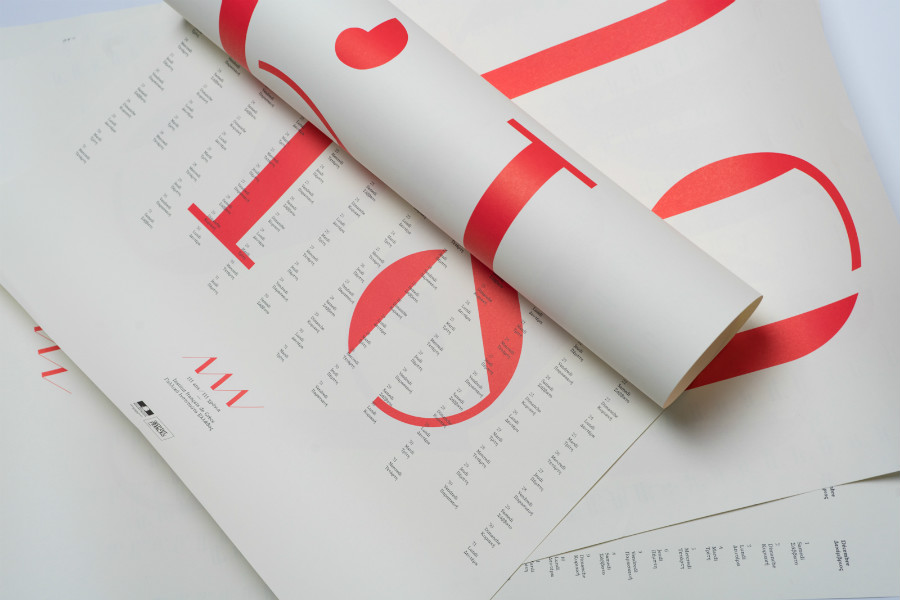
JOSHUA: It’s also the nature of our work which has to deal with this idea of doing something in the public space. So we’re literally working in the public space. Eventually the idea would be that we’re like an artistic practice where we expose ourselves in a public space working. Then also this idea of the borders, I think it’s quite important. To be on the border and not be part of a specific side. Maybe that’s good for this kind of work, because you have a kind of objectivity, the capability of observation on either side or on different aspects of reality. So locality is a kind of positioning. Let’s say for example that you are at an exhibition opening or outside or at someone’s party; if you look at how people are taking position in space, there are some who are lonely on the side, some people are at the door, others are at the tables. It’s random but it’s also very significant somehow, that in some moment you would choose a certain position or a certain point from which you want to see the world. Maybe it’s a random procedure, but it says eventually something about yourself. And then of course it’s very interesting that we did this typeface—this was later on when we realised that we were so close to Didotou Street. And Didotou has a huge historical aspect which is specifically related to the field of editions and printing, and there are still some printing houses and editions there.
KOSTAS: It also relates to the first font that was translated in Greek. So the first books in the Greek language back in the end of the 18th century that were printed in Italy were set in this font, the Didot font.
So Didot was a type maker? A publisher?
KOSTAS: The Didot family was a family of French printers and publishers, many members of which were philhellenes. Didotou Street in Athens is named after them. Firmin Didot who is the developer of the Didot font was also part of this family, so this is how we got interested in the street and the stories around its name. At some point we wanted to design an identity for a space that was named after a villa, and we started thinking about the fonts that were in use during the modernist era, that were more like stencil fonts. And then we found a connection with a font that Le Corbusier was using which was a stencil type. Which was about the time we realised we were next to Didot/Didotou Street, and we thought that it was too much of a coincidence to ignore, so we created a new font where we kept some of the structural and aesthetic elements of the Didot font but made it more logical or geometrical in a way. At that time this was a minor project, because we didn’t know when we were making this font that it would find a place in something more interesting and more important for us.
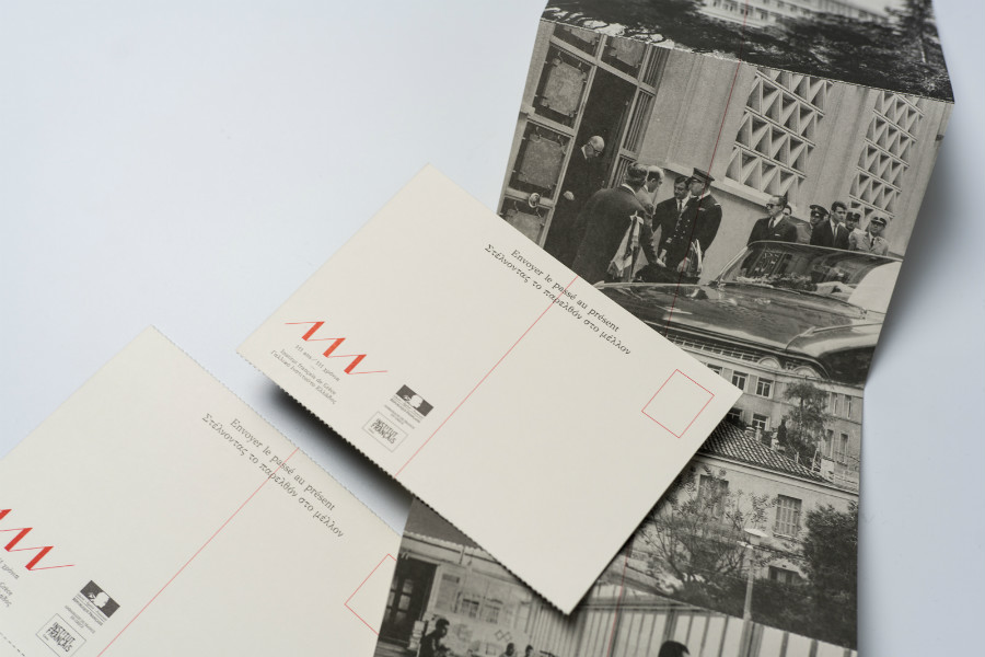
JOSHUA: Yeah, we got approached from the Institut Français to design an identity for the 111th anniversary of its presence in Greece. And that was a great opportunity to use this typeface because on the one hand we are right in front of the Institut and we’re completely embedded in the locality of this institution.
KOSTAS: It’s pretty much the embodiment of our locality here.
JOSHUA: So we were diving into this story of Didot, and if I’m not mistaken the first printing presses were brought to independent Greece by the Didot family to publish things in Greece. So they already had Greek glyphs in their typefaces. They were true philhellenes and the story coincided really beautifully with the Institut being here and wanting to remember its history of presence in Greece and its friendship with Greece. And we thought this could be embodied by a typeface, which could then become the tool or the vehicle for a cultural exchange that happened and still happens through the Institut Français.
KOSTAS: There’s a lot of material we’re doing as part of this project, like postcards, programmes and so on. We even did an installation using this logotype and the idea of a red thread as a symbolic vehicle for telling the story.
JOSHUA: The logotype is of course the number 111 but it’s also three times one, as to say that there was something before and there will be something after. A proposition to see history as a continuation. It’s also like some very famous posters from May 1968, with a small factory illustration if you remember... The logo reminds of the factory’s roof. So maybe we can see history as a factory in which things are elaborated. So the installation we did is an extruded form of the logotype, like a 3D version of the logotype that has the shape of a paravane which we wrapped with red rope.
KOSTAS: Another reference for this identity was the colour schemes and part of the design from Gallimard, which is a very well-known French publisher.
JOSHUA: It’s kind on the classic side, but with this reference we define something typical, an archetype, like the editions of Gallimard and especially the Serie Blanche that we really like. It’s classic but at the same time it’s timeless, which is something great also about the French. You could say that they’re conservative or something, but if something is good they will preserve it. And they’re not like the Dutch, who have this mania of changing everything all the time. Holland is by definition a country of rupture and non-continuation, like constantly living in this concept of rupture. But France and to a great extent the Mediterranean countries have this approach that could be seen as conservative but also has a sense of continuation, of keeping what’s good.
So what are the other components of this project apart from the installation and the publications?
KOSTAS: We did some posters, postcards, everything really. There will be more publications, and now we’re working on the identity for the Francophonie film festival that is organised by the Institut Français. I guess it’s going to be a long year!
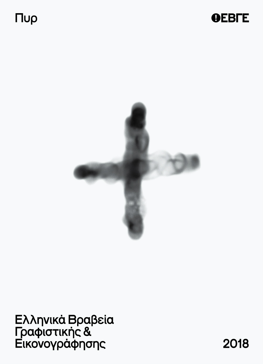
You were the Agency of the Year last year at EBGE awards in Greece. Tell us a bit about the new identity for this year’s awards that you’ve designed.
KOSTAS: We wanted to propose something that isn’t very designed somehow, if possible not designed at all. So to think of something like a simple gesture but also while trying not to manipulate things too much. Like to give it a purer raw form somehow but also to convey an essence. So we thought of this typical gesture of Greek people marking their doors with the soot of a candle in Easter. This is a classic gesture of good luck or a sign of rebirth... And let’s not forget that the cross is kind of fundamental—again, an archetype— made even before Christianity and keeps on repeating in different cultures and civilizations somehow.
JOSHUA: Apparently the cross makes its appearance since the neolithic times. It's like this aximundi [Axis Mundi] you know, an idea that relates the horizontal to the vertical as an extremely powerful, even philosophical gesture. Two basic movements everyone can make create this very loaded symbol that is at the same time the most accessible symbol that has been used and abused extensively. And then there’s just also the banality of reality, where we relate the cross to other processes like the print crosses we see on the registration marks printers use to combine different printing plates. So the cross is also a tool somehow. And then we wanted to play with this idea of making graphic design with light, to bring something with light, to write with a negative form of light.
And the words you used are also religious?
KOSTAS: We weren’t trying to create phrases or new cliches. But as we really have a lot of cliches that are wishes and sayings that are related to Easter, and the EBGE ceremony usually happens close to Easter, we used phrases connected to the cross like "κάνε τον σταυρό σου", "λάβετε φως", that sort of thing. We thought these phrases could have their place in this environment. It's not about making fun of these things or trying to force a relationship, but with a playful attitude to allow these things to penetrate this environment of the design awards, which is kind of critical and expecting to see certain things. By opposing ourselves to this expectation we put the audience to think something through that. Even if you get just a smile out of that, you’ve made a lot of steps towards considering the audience through what you do.
So when designing visual communications, how do you take the audience into account? What is your idea of an audience?
KOSTAS: It's a strange question. I think if you design something that you would like to have or you’d like to buy or you’d like to consume: maybe there’s a design process in that.
JOSHUA: Yes, especially if you consider that you are the first public, you are representing the public at that moment, I think that you carry the world in you. It's kind of stupid to deal with all these marketing theories, and try to define a specific target group or whatever they call it. I find it always extremely reducing and humiliating for a potential public to already consider them as being a group of people that have certain predefined ideas. Maybe these people don't know really, maybe they are much like us. It's maybe better not to consider the public as something preexisting because then you would form assumptions about people about their age, their cultural references blah blah. And anyway we all have all sorts of cliches in us that we cannot escape. That’s also the weird thing about it.
KOSTAS: I don’t think we want to escape them, we actually want to use them. When you design something you always have the chance to start a dialogue with the audience. I guess to be a designer is to have the power to say the first word to someone you want to have a dialogue with.
Visit our Facebook page to see the new cover. Typical. Organization for standards & order is listed in the und. Athens directory under the Open Studios category at no. 51. You can also cross yourselves and visit their super-brand-new website here.